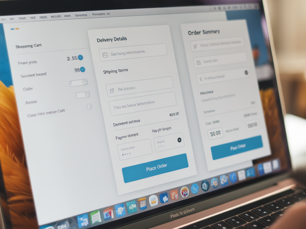
I’ve redesigned more than a handful of checkout flows for startups and independent shops, and one pattern keeps repeating: the places where people drop off are rarely about price alone. They’re about friction — micro-moments where the experience interrupts intent. In this piece I’ll walk through a practical, tactical approach to redesigning a checkout to reduce cart abandonment, with concrete heuristics, copy and UI patterns you can apply right away.
Why checkout friction matters (and what “friction” actually is)
Friction is any obstacle that increases cognitive load, uncertainty, or effort during checkout. It’s not just slow pages or ugly buttons — it’s ambiguous form fields, surprise costs, unclear shipping timelines, and validation messages that feel punitive. Each small annoyance multiplies because checkout is a high-stakes micro-task: users are committing money and time, and even a tiny doubt can trigger abandonment.
When I measure checkout funnels I look at both quantitative signals (dropoff per step, time on page, error rate) and qualitative signals (session recordings, micro-interviews, support transcripts). The best fixes come from pairing those perspectives.
Common UX friction points I always audit first
- Unexpected costs: shipping, taxes, fees revealed late in the flow.
- Forced account creation: login walls that interrupt purchase intent.
- Lengthy forms: too many fields or unclear field labels.
- Poor error handling: vague validation messages or loss of entered data.
- Slow or janky responsiveness: mobile performance issues or broken inputs.
- Limited payment options: missing familiar methods like Apple Pay, Google Pay, or PayPal.
- Trust gaps: no security cues, unclear return policy, or weak brand credibility on checkout pages.
How to run a quick audit (10–30 minutes that pay off)
Start with a fast heuristic review, then validate with data:
- Open your analytics and identify the largest dropoff step in the funnel — that’s your highest ROI target.
- Complete a purchase on desktop and mobile as a new customer. Note surprises and friction points.
- Watch 5–10 session recordings focused on users who dropped off; look for frustration (repeated clicks, rapid scrolling, back navigation).
- Scan support tickets and FAQs for recurring purchase-related questions (shipping, coupons, taxes).
Design principles I apply when redesigning a checkout
- Progressive disclosure: show only what’s necessary at each step; hide advanced options until needed.
- Reduce decision points: minimize choices that don’t speed purchase (e.g., too many shipping speed options upfront).
- Preserve user input: never drop entered data when the page reloads; persist it locally if needed.
- Instant feedback: inline validation, real-time shipping and tax calculations, and clear success/error states.
- Reassure at moments of doubt: microcopy that confirms security, return policies, and delivery estimates.
Practical UX changes that reduce abandonment (apply these first)
These are small, high-impact changes I roll out before larger technical work:
- Show total cost early: display an estimated total (including shipping/tax) in cart. Even an estimate reduces surprise.
- Offer guest checkout: allow purchase without creating an account; offer account creation post-purchase via an email CTA.
- Enable fast checkout options: implement Apple Pay / Google Pay and one-click flows where possible.
- Shorten forms: ask only for what you need: name, shipping address, payment. Make optional fields optional and clearly marked.
- Prefill and autocomplete: use postal address APIs and browser autocomplete to reduce typing on mobile.
- Show progress: a lightweight progress bar or step indicator reduces uncertainty about how long the process will take.
Copy and microcopy that prevents doubt
Words matter. I treat microcopy like a UI component and test it. Swap vague lines for specific reassurances:
- Instead of “Secure checkout” try “Secure checkout — payments encrypted with Stripe.”
- Instead of “Shipping calculated at checkout” show “Estimated delivery: 3–5 business days. Free shipping over £50.”
- For errors, avoid “Invalid input.” Use inline: “Please enter a valid UK postcode (e.g. SW1A 1AA).”
Handling validation and errors gracefully
Bad validation is a trust-killer. My approach:
- Validate inline as the user types, but only show messages after the user moves away from the field.
- Be specific: tell users what’s wrong and how to fix it.
- Support multiple formats for phone numbers and card expiry formats, and normalize inputs client-side.
- When a server error occurs, preserve form content and provide a helpful next action (try again, contact support via chat), with an error ID for support lookup.
Trust signals and payment flexibility
People abandon because they don’t trust the site or don’t see their payment method. I recommend:
- Displaying well-known payment logos near the pay button.
- Showing security badges (PCI, SSL) and linking to a short page explaining refunds and data handling.
- Offering multiple payment flows: card, wallet (Apple/Google Pay), and PayPal or Klarna for instalments if appropriate to your average order value.
Mobile-first considerations
Mobile is different: space is limited, attention is scattered, and typing is costly. I favor:
- Large, tappable CTAs and a sticky “Checkout” summary that minimizes navigation.
- Minimal typing via address lookup, saved profiles, or scanning options where useful.
- A one-column layout that reduces cognitive switching; avoid side-by-side fields that wrap oddly on narrow screens.
Measure impact: what metrics to track
Don’t guess. Track these KPIs before and after changes:
- Checkout conversion rate (sessions that start checkout → completed purchases)
- Dropoff rate per step
- Time to complete checkout
- Error rates per field
- Refunds and support tickets related to purchase issues
Testing roadmap — quick A/B ideas
I roll out experiments incrementally so we learn fast:
- Test guest checkout vs forced account creation.
- Test estimated total in cart vs hidden fees until checkout.
- Test Apple/Google Pay presence vs absence on mobile.
- Test different trust badges and microcopy on the payment step.
| Action | Why | Quick wins |
|---|---|---|
| Show estimated total in cart | Reduces surprise costs | Immediate trust increase, lower abandonment |
| Enable guest checkout | Removes barrier to purchase | Higher checkout starts, easier conversion |
| Add wallet payments | Faster payment flow on mobile | Lower time-to-pay, fewer typed inputs |
| Improve inline validation | Reduces form errors and frustration | Lower error rates, fewer support tickets |
If you want, I can draft a prioritized list of changes based on your analytics or mock up a mobile-first checkout wireframe you can test within a week. On Magque Co I often publish step-by-step templates and component-level copy that teams can drop straight into prototypes — tell me which platform you use (Shopify, WooCommerce, custom React, etc.) and I’ll tailor the next steps.