How to use analytics thresholds to decide when a feature needs redesign versus a marketing push

How to use analytics thresholds to decide when a feature needs redesign versus a marketing push

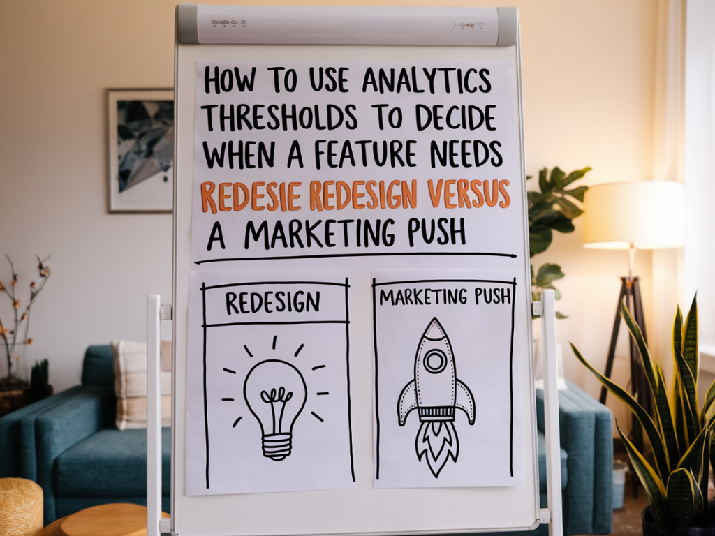
I often face the same dilemma when reviewing product analytics: a feature isn’t performing as expected, but is it broken, or is it simply undiscovered? Over the years I’ve learned that a clear set of analytics thresholds — combined with focused qualitative signals — turns guesswork into a repeatable decision process. Below I share the framework I use to decide whether a feature needs a redesign or just a marketing push.

Why thresholds matter (and what they aren’t)

Thresholds are not magic numbers. They’re decision triggers — practical cutoffs that help you move from debate to action. Without them, teams fall into three traps: endless debate, knee-jerk redesigns, or wasted marketing spend. With the right thresholds, you can answer simple but critical questions fast: is the feature being discovered? is it being used correctly? does it deliver value when used?

Important caveat: thresholds should be tailored to your product, traffic, and business model. What works for a SaaS onboarding flow won’t map to a marketplace or a consumer mobile app. Use the numbers below as a starting point and iterate.

Core metrics to track

Before you set thresholds, pick a clear, measurable KPI for the feature. Common choices:

  • Discovery rate — percentage of relevant users who see the feature (e.g., exposed to a CTA, visited the feature page).
  • Activation rate — percentage of users who complete the first meaningful action with the feature.
  • Retention/return usage — percentage who use the feature again within X days.
  • Task success / completion rate — for task-oriented features (e.g., checkout, publish flow).
  • Business conversion — revenue, upgrades, retention attributable to feature use.
  • Each of these answers a different question. Discovery tells you whether users even know the feature exists. Activation tells you whether the feature is understandable and valuable in the short term. Repeat usage indicates sustainable value.

    Suggested thresholds and what they imply

    Below is the simple table I use in early audits. Treat it as a hypothesis checklist you validate with experiments and qualitative feedback.

    Metric Threshold (starter) Interpretation
    Discovery rate < 20% of target users Likely a visibility/marketing problem — prioritize awareness or UX entry points.
    Activation rate < 10–15% of exposed users Users see it but don’t complete the first meaningful action — consider usability fixes or education.
    Task success rate < 60% High friction; redesign the flow or remove blockers.
    7‑day return usage < 15% Feature isn’t sticky — question product-market fit or perceived value.
    Feature-driven conversion (revenue) < 1–2% lift If marketing exposure is high but conversion lift is negligible, redesign to improve value or clarity.

    How I run the decision process

    When a feature underperforms, I run through these steps quickly — the faster we get to evidence, the less time we waste on costly redesigns or ineffective promotions.

  • Define the target user segment and primary KPI. Be specific: “logged-in users who reached settings” or “trial accounts who saw the CTA.”
  • Measure discovery vs activation vs retention. Segment by device, traffic source, cohort, and user persona.
  • Collect qualitative signals: session recordings (Hotjar/FullStory), user interviews, support tickets, NPS comments.
  • Map results to the threshold table. Use the highest-priority failing metric to choose the next action.
  • Design lightweight experiments: A/B for marketing messaging and visibility, prototype tests for redesigns.
  • Decision rules I actually use

    Here are the heuristics that usually determine my recommendation:

  • If discovery < threshold: Marketing push first. Don’t redesign something users don’t see. Try targeted in-product announcements, onboarding highlights, email campaigns, and contextual CTAs. Monitor activation. If activation remains low after a visibility lift, revisit design.
  • If discovery is healthy but activation < threshold: Usability tweaks and education. Run small UX changes: clarify microcopy, reduce form fields, add inline help, or show a short tooltip. Run quick usability tests (5–8 moderated sessions) or session recordings to find the exact friction point.
  • If activation is OK but task success < threshold: Redesign the flow. When users try and fail, you need product changes: restructure steps, simplify decisions, or add error-handling. Prototype and test before full implementation.
  • If activation and success are strong but retention is low: Value-proposition redesign or product changes. This often means the feature solves a one-off problem or lacks continued usefulness; consider adding complementary functionality, reminders, or social proof that increases long-term value.
  • If marketing lifts visibility but conversion to revenue is flat: Revisit messaging and perceived value. Sometimes the marketing highlight attracts the wrong users; refine targeting and adjust positioning. If targeting is correct and conversion still flat, redesign to improve perceived value or the actual outcome.
  • Examples from real work

    Example 1 — a B2B dashboard feature. Discovery was ~12% for accounts that could benefit from the dashboard. We ran an in-product announcement and a segmented email campaign. Discovery jumped to 45% and activation rose from 8% to 20% — proving visibility was the main issue. We halted a planned redesign and invested in onboarding flows and templated reports instead.

    Example 2 — a consumer app’s “share to save” feature. Discovery was 55% but activation was 6% and task success was 40%. Session recordings showed users hit a confusing permission dialog and abandoned. We implemented a clearer CTA and a simplified permission flow; activation doubled and success rose to 75%. That was a targeted UX fix, not a full redesign.

    Quick experiments you can run in a week

  • Visibility A/B: show the feature on the home screen vs. hidden menu and measure discovery over 7 days.
  • Microcopy test: two versions of the CTA (value-led vs. action-led) to measure activation lift.
  • Permission flow simplification: replace a modal with contextual inline copy and measure task completion.
  • Targeted email cohort: send a short educational email to users who haven’t discovered the feature and track activation.
  • How to avoid common pitfalls

    Two mistakes I keep catching teams making:

  • Rushing to redesign without testing visibility. That wastes engineering time and can make things worse. Always rule out low discovery first.
  • Overfitting thresholds to a single cohort or channel. A feature may perform poorly in organic search but well in paid channels. Use segmented thresholds and adjust decisions accordingly.
  • Finally, keep thresholds visible. I add them to the feature brief and the analytics dashboard so stakeholders see when actions are triggered. This reduces meetings and speeds up experiments.

    If you want, I can help you build a simple dashboard template with these thresholds or walk through a specific feature’s metrics and recommend the next experiment. I find a 2-hour audit usually surfaces whether you need a small UX tweak, a marketing push, or a proper redesign.


    You should also check the following news:

    Tutorials

    How to run a customer interview that surfaces real objections, not polite feedback

    02/12/2025

    I run customer interviews all the time — for product decisions, landing pages, onboarding flows, and early pricing experiments. Over the years I...

    Read more...
    How to run a customer interview that surfaces real objections, not polite feedback
    Design

    How to redesign a checkout flow to reduce cart abandonment by addressing common UX friction

    02/12/2025

    I’ve redesigned more than a handful of checkout flows for startups and independent shops, and one pattern keeps repeating: the places where people...

    Read more...
    How to redesign a checkout flow to reduce cart abandonment by addressing common UX friction