I’ve watched too many promising B2B SaaS trials fizzle out because onboarding was treated like an afterthought. A great product is necessary but not sufficient — the way you introduce new users to value determines whether they stay. In this piece I’ll walk you through how I design onboarding flows specifically aimed at improving trial-to-paid conversion: the mindset, the measurable steps, the content patterns, and the tooling that actually move the needle.
Start from the metric: define “value” and the conversion event
The first thing I do is get ruthless about the metric. What exactly counts as a trial converting to paid in your funnel? Is it users who upgrade within 14 days, 30 days, or after hitting a usage milestone? You can’t optimize what you don’t measure.
To me, onboarding is about shortening the time to “aha” — the moment when a user experiences the core value of your product. For different products, that looks different:
- For a CRM it might be creating the first contact and logging an activity.
- For a collaboration tool it could be inviting teammates and completing a task.
- For an analytics product it might be connecting the first data source and seeing a dashboard.
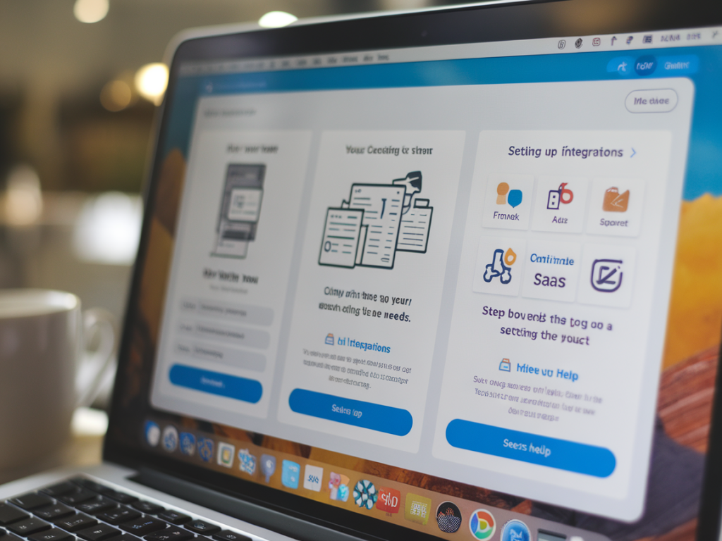
Once you define the aha and the conversion window, instrument it. I use Mixpanel or Amplitude to track events and cohorts, and Stripe or Paddle to instrument upgrade events. This gives me a baseline and allows me to measure impact after each experiment.
Map the onboarding journey from both product and emotional lenses
A flowchart of clicks is useful, but I always layer emotional states on top: curiosity, confusion, progress, relief, delight. Those emotional beats guide where to add nudges, explanations, or human touch.
Ask: where will users feel stuck, and what’s the smallest intervention that reduces friction? Typical friction points are:
- Account setup (passwords, confirmations)
- Initial configuration (integrations, data imports)
- Unclear first task (no clear next step)
- Perceived lack of value during trial (features look cool but don’t solve a problem)
Design patterns that reliably increase trial-to-paid conversion
Over the years I’ve tested patterns that consistently help. I don’t expect every pattern to be relevant to every product — pick the ones that map to your friction points.
- Progressive disclosure: hide complexity until it’s needed. Ask only for what’s necessary to let the user experience value.
- First-success task: craft a single, guided path that leads to the aha — a checklist, a guided tour, or a template that’s prefilled with sample data.
- Feature gating with educational nudges: show premium features during trial but explain their business impact and how they’d change workflows.
- Milestone prompts: celebrate small wins (e.g., “Nice — you’ve connected your first integration!”) and immediately suggest the next high-impact action.
- Time-bound incentives: use a gentle scarcity like “upgrade for team billing within your trial to avoid interruptions” paired with ROI messaging.
- Human touch: trigger outreach when users reach high-intent signals — e.g., repeated visits to billing, or creation of multiple projects. Live chat and proactive emails work well here.
Playbooks: what to show, when, and how
Here are playbooks I commonly implement. Each is tied to a measurable event so we can A/B test.
- Welcome email + in-app checklist: Immediately after signup send a short email with a checklist and links. In-app, show a persistent checklist that tracks progress toward the aha.
- Contextual modals: Avoid interruptive tours. Use contextual modals that appear the first time a user lands on a page needing action, and let users dismiss or “remind me later.”
- Interactive templates: Offer templates that reduce setup time — for example, preconfigured reports or project templates tailored to common use cases.
- Behavioral emails: Sequence emails based on actions: “You created X but haven’t invited teammates — here’s why collaboration unlocks value.”
- Checkout meters: During trial, show an unobtrusive meter that predicts what plan they’ll need based on current usage, paired with ROI-focused copy.
Human touch: when to intervene
Automation scales, but human interactions close deals. The key is to intervene at high-intent moments, not to bombard everyone.
Here are signals I use to trigger outreach:
- Reached a product threshold (e.g., uploaded 500 contacts)
- Repeatedly visiting billing or pricing page
- Multiple failed attempts to complete a critical setup step
- Team expansion inside the account (multiple seats created)
I prefer short, consultative outreach: a quick in-app message or email offering help, asking about goals, and suggesting a next action. If the account is high-value, schedule a demo tailored to their setup. Using Intercom, HubSpot, or Crisp makes this scalable.
Experimentation framework
Every change should be an experiment with a hypothesis. I use a simple template:
| Hypothesis | Changing X will increase Y by Z% |
| Metric | Trial-to-paid conversion within 30 days |
| Segment | New signups in SMB plan |
| Duration | 4 weeks |
| Success criteria | Statistically significant uplift at p < 0.05 |
Run one change at a time for a cohort and monitor intermediate metrics: time-to-first-success, feature engagement, and trial drop-off points. If you see lift, roll out; if not, iterate quickly.
Copy and messaging: focus on outcome not feature
Onboarding copy should answer: “What will this get me?” not “How does this work?” Swap feature-heavy language for outcome-driven microcopy. Instead of “Connect Slack to receive notifications,” use “Get faster approvals — connect Slack to alert your team.”
Also speak to the buyer persona. For an ops manager highlight reliability and integrations; for a head of growth highlight time-savings and measurable lift. Personalization (even if it’s just mentioning the company name) increases engagement.
Reduce perceived risk with transparent pricing and frictionless upgrade
Pricing ambiguity kills conversions. Show clear plan comparisons, highlight what’s included during the trial, and make upgrades painless. I prefer in-app billing flows with one-click upgrades (Stripe Billing, Paddle). Allow cardless trials or seamless add-card flows close to upgrade time — removing even one step can lift conversions significantly.
Tools and templates I use
- Product analytics: Mixpanel or Amplitude for event cohorts
- In-app guidance: Appcues, Pendo, or Userpilot for checklists and contextual modals
- Chat and outbound: Intercom for live chat and automated outbound sequences
- Billing: Stripe Billing or Paddle for streamlined upgrades
- Experimentation: VWO or Optimizely for visual experiments; or run server-side variants using feature flags
Common pitfalls I avoid
- Overloading the first session: Too many tips and a long tour usually push users away. Guide them to the first success instead.
- One-size-fits-all onboarding: Different personas need different paths. Segment onboarding based on role or use case.
- Neglecting instrumentation: If you don’t track the right events, you’ll be optimizing the wrong things.
- Waiting too long to intervene: If a user is stuck on a critical step for 24-48 hours, that’s a missed opportunity for proactive help.
Designing onboarding that improves trial-to-paid conversion is part art, part systems work. You need empathy to understand user intent, craft to lead them to the first success, and measurement to know what actually works. If you want, I can help outline an onboarding map for a specific product and identify three lightweight experiments to run in 30 days — tell me your product and the current trial metrics and we’ll design the first sprint together.