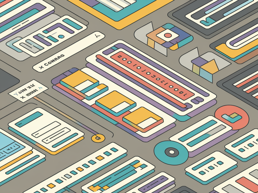
I build a lot of interfaces — landing pages, dashboards, and small product MVPs — and one thing that consistently saves me time is a reusable UX pattern library in Figma. Over the years I’ve refined a setup that’s compact, predictable, and easy for teammates (and future me) to pick up. Below I share the approach I use to create a pattern library that reduces repetitive design work, improves consistency, and accelerates handoff.
Why a pattern library matters
Before we dig into steps, let me be direct: a pattern library is not a style guide that collects inspiration. It’s a working tool — a living collection of components, tokens, and usage guidance that you and your team actually pull into product files. When done right it:
- Reduces cognitive friction — you don’t recreate the same button or card every time.
- Speeds up iterations — swapping variants and updating tokens propagates to all instances.
- Improves alignment — designers, PMs and engineers share the same source of truth.
Start with design tokens
Design tokens are the atomic variables for your system: colors, typography, spacing, radii, shadows. I always start here because components are easier to maintain when they reference tokens instead of hardcoded values.
- Create a “Tokens” page in your Figma library file.
- Define Color Styles for primary, secondary, neutral, semantic states (success, error, warning) and functional tints (surface, background, muted).
- Add Text Styles for body, labels, headings, and small UI text. Keep naming consistent: e.g., Text / Body / 16 / Regular.
- Create Effect Styles for shadows and stroke styles for borders.
I often use the Figma Tokens plugin to export JWT-compatible tokens for engineering or to sync values across files. Even if you don’t use a plugin, having styles defined in Figma makes it much easier to update globally.
Design components with variants and constraints
When building components, follow these principles:
- One purpose per component — a button does one job; a card is a container for a content pattern.
- Use variants — group size, state, and tone into variants instead of multiple separate components.
- Leverage Auto Layout — make components responsive to content changes.
- Set constraints — ensure components behave predictably when placed in frames of different sizes.
Example: for Buttons I create a single component with variants for size (small, medium, large), tone (primary, ghost, destructive), and state (default, hover, disabled). That way a designer only needs to switch a variant instead of swapping components manually.
Structure your library file
Organization matters. My preferred Figma library file has pages that map to logical areas:
- 00 - Tokens
- 01 - Foundations (colors, type, grids)
- 02 - Components (atoms: buttons, inputs)
- 03 - Patterns (molecules and templates: cards, forms, lists)
- 04 - Layouts & Templates (page-level components and examples)
- 05 - Documentation (usage guidance and code snippets)
Keep naming consistent and use frames to group related components. Prefixing with numbers (00–05) keeps a predictable order.
Document usage — not just visuals
Pattern libraries live or die by clarity. Include short guidance directly inside the library file so designers don’t need to hunt for external docs.
- When to use the component (primary CTA vs. secondary).
- Do’s and don’ts (avoid nesting primary buttons inside cards, for example).
- Accessibility notes (contrast requirements, keyboard focus behavior).
- Common copy length and spacing constraints (e.g., “Title should be 30–70 characters”).
On the Documentation page I often include quick HTML/CSS snippets or links to the code repo so engineers can see the expected implementation. If you use Storybook or a design-to-code tool, link to specific story IDs.
Make components flexible for real-world use
Designers often create beautiful, rigid components that break in production. I build for flexibility:
- Use Auto Layout with padding and spacing tokens so text truncation and icons remain aligned.
- Expose only necessary properties — avoid a thousand boolean toggles that make the component fragile.
- Use masks and nested frames carefully to ensure icons and images scale correctly.
- Provide variants for responsive behavior (compact vs. regular) rather than manual resizing.
Versioning and governance
A living library needs rules. I keep a simple governance model:
- Assign a library owner (usually a senior designer) who reviews changes.
- Use a “proposed” page or a branch file for experimental components.
- Tag releases with a version note inside the library and publish to the team library when ready.
Figma doesn’t have full branching like code, but you can duplicate the library file as a draft. I also maintain a changelog frame in the library file so engineers and PMs can see what changed and why.
Publish and distribute
Make the library available via Figma Team Libraries. Share a short onboarding doc for teammates explaining:
- Where the tokens live and how to update them.
- How to use components (search terms to find things).
- How to request new components or report issues.
Encourage designers to use instances and variants rather than detaching: instances let you ship global fixes instantly.
Work with engineers
Creating a bridge to engineering prevents the “designed in Figma, rebuilt differently” syndrome:
- Sync tokens with the frontend via JSON exports or plugins like Figma Tokens or Design Tokens.
- Share component props and behavior expectations in the documentation page.
- Use code references (Storybook, component library URLs) so designs map to living components.
Measure and iterate
After the library is in use, measure its impact. I track simple signals:
- Figma file reuse — how many files pull components from the library.
- Time saved — estimate how many hours per week the team avoids rebuilding patterns.
- Design debt — backlog items that require pattern updates (e.g., many instances overridden incorrectly).
Regularly review which components are frequently overridden. If a pattern is overridden often, it’s a sign the component lacks flexibility or missing variants — fix it.
Practical checklist to get started
| Step | Action | Outcome |
|---|---|---|
| Create tokens | Define Color, Text, Effect styles | Single source of truth for visuals |
| Build atoms | Buttons, inputs, icons as components with variants | Reusable building blocks |
| Compose patterns | Cards, forms, lists using atoms | Real-world UI solutions |
| Document & publish | Usage notes + publish library | Team adoption |
One final note from practice: keep the bar low for initial adoption. A small, well-documented set of components is better than a huge, half-broken system. Start with the patterns you use every week — hero header, primary CTA, card, and form field — and expand from there. Over time your library becomes the fastest path from idea to polished product.